I heard about a team being asked to provide burndown charts in their demos to stakeholders. My first reaction was: why!? In this blog post, I’m going to try to articulate why I believe burndown charts are often meaningless at best and harmful at worst, and why even if they work well for an engineering team it doesn’t make sense to show them to anybody outside the team.
But first: The counter argument
But, Erry, burndown charts are useful! They help us know how much we can put in each sprint! If we don’t look at our velocity, how do we know if our sprint goals are achievable?
Sure, in theory. Except, I’ve never seen them used that way in my entire career. Plus, multiple times, the conversation has gone somewhat like this:
PM: We didn’t meet our velocity of 25 last sprint
Engineer: That’s because we put too much in the sprint, and stuff was still only as far as QA when we finished. Maybe we should try putting in fewer points?
P: I’m going to put in 30 points, I’m sure if we all pull together we can achieve it
E: ….
Now if your team actually uses them only between yourselves, and doesn’t show them to PMs and shareholders, they could actually be useful. You could use them to tell the PM what they want this week is way too much 😉
Having said that, if you are using sprint points and burndown charts in your team, and it works for you and you’re happy, hey, go for it, and maybe write a comment saying how you manage that. This is just an opinion piece after all.
Why sharing burndown charts is meaningless
Going back to the situation described at the beginning at the post, your stakeholders want to know what you have developed in a sprint and give feedback on it. If it’s done correctly, your stakeholders should be your users, or at the very least people who represent your users (such as sales, customer services, and so on). It’s perfectly reasonable to give them a list of what you planned to achieve and which of those things you actually achieved, but what’s the point of showing them the burndown chart?
Scenario 1
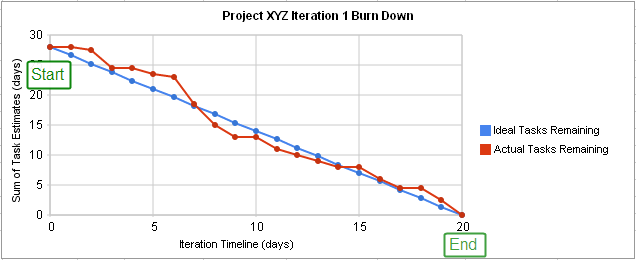
Imagine a situation where you had 30 points in a sprint and achieved 25, and on top of that in good time, so the burndown chart moved quite quickly. You have a pretty good looking graph, and you show that to stakeholders. Congratulations, you did lots of work!
However, those points represent complexity, not importance or impact. So what if the 5 points you didn’t manage to achieve were high impact things and the 25 points weren’t as high impact? Well, now you have a meaningless chart nobody cares about, and a high importance feature that wasn’t done.
Scenario 2
Having noticed that counting points is meaningless, you switch to charts that don’t show a number of points, and only show a percentage, or maybe you decide to point everything a ‘1’.
Congratulations, now your chart is even more useless to your stakeholders than before. Literally all you are showing is that you moved quickly and turned around a predefined number of tasks in two weeks. There’s still no measure of impact, and now there’s not even a measure of complexity. The chart is as useful as showing the number of days you spent in a sprint. Hey everyone, let’s have a chart starting from 10 and going to 0. Burndown chart done.
Don’t get me wrong. Again, this chart could be extremely helpful used between engineers in your team, but in my opinion it’s worthless to stakeholders.
Why burndown charts are harmful
I could write a whole book on this, but I think I’ll settle with writing a bullet pointed list of some of the worst things I’ve seen happen
- As I said before, management sometimes use them to tell people to do more work in the same amount of time without fixing any of the things that slow people down. Yes, even in good companies.
- Teams sometimes brag about the number of points they achieved and compete with other teams. Yes, really. This is completely meaningless because one team’s 5 is different from another team’s 5. “Why is X startup doing 100 points a sprint and we only do 70!?”. As good a question as “why does Jane have apples and Chloe have oranges?”
Even if sprint points represented exactly the same thing for everyone, some teams have fewer people than others and some teams have more complicated tasks than others. It’s probably easier to develop and test 8 1-point tickets than it is to develop and test a single 8-point ticket. - They cultivate burnout culture, which is why I want to call them burnout charts. In general, agile sprints appear to be the same as running one athletic sprint after the other with no rest. Software development is a marathon, not a series of back-to-back sprints. There needs to be time for relaxing, unwinding, and learning.
- People often don’t look at why a burndown chart is ‘bad’ anyway. What if it’s bad because you don’t have time to write automated tests (because you have to do 50 story points in a sprint) and now QAs have to manually test everything? What if it’s bad because the release process is long-winded and complicated?
If your organisation is actually addressing those problems, good – it means that you can use a ‘bad’ burndown chart as evidence that something needs to be done. But if they continue having the same practices, the whole thing is meaningless.
What to do instead?
Let engineers use burndown charts if they like them, but don’t force them to share them with product and stakeholders. If they do share them, and they tell you that there is a bottleneck somewhere, listen to them and address their concerns.
Allow some breathing room in sprints for learning and experimentation – having a feature half a day later won’t matter that much when your engineers use their free time to learn something that helps enhance user experience and therefore get you closer to your KPIs.
Remember the timescales you are dealing with are extremely miniscule in the long run. I’ve heard (on more than one occasion!) management say that 3 weeks for something is too long, but 2 weeks would be ok. Software is turning over faster than ever before! If there’s a tight deadline that the business’s livelihood depends on, sure, the extra week could be disastrous.
But when we’re talking about day-to-day work, and estimates at that, the difference adds up to basically nothing in the long run. This is extremely frustrating when it comes from a successful, profitable, mid-sized or large organisation; you’re not going to go out of business if a piece of work costs an engineer’s salary for two more weeks
In conclusion
I’m not against agile. I’m not against sprint points. I’m not even against burndown charts! However, I see many examples from people in the industry saying that those things are used as a way to rush out broken code, or even as a stick to beat people with. Thankfully, that hasn’t been my personal experience, but I believe it when people say it happens.
I think that software engineers are, in general, very smart and hard working, and don’t need so many eyes on how fast they are performing. It’s completely the wrong metric. We should be measuring what impact our work has, even if that only means looking at how much profit has increased by.
Once again, if your team is genuinely happy with those practices, if they help them, great. Otherwise, you may want to stop and think about what you’re actually hoping to achieve by obsessing over those numbers so much, and if it’s even worth the effort spent on doing so.
PS: if you want to read about metrics that matter, head over to this post
Thanks for your thoughts – quite useful. I am a director with 2 teams that just started doing Agile in January (transitioned from Waterfall). What reports do you believe are the most useful and relevant to executives wanting to know how teams are performing short and long term, as well as when you add or lose team members. What KPI’s /reports do you use to provide visibility to managers/directors?
Thank you for any information on the matter!
Hi Carmen, thanks for your comment!
I’m not a manager, so I can only speak for experience.
If you’re doing Agile, it’s important that you include your users early on. These may literally be people who use your platform, or stakeholders representing them.
Make sure you iterate with your stakeholders often, otherwise you’re just doing Waterfall with a different coat of paint. Show them a demo of your wireframes (your designers are making UX wireframes before the real thing, right?). Show them a demo of what your team has produced every 2 weeks, even if it’s not finished, to allow for feedback. And of course show the finished product to a wider team! That way, You prevent “we spent 6 months on this feature and it’s nothing like the CEO imagined”, and other horror stories.
So many places I’ve worked at will only demo the product once it’s perfect because they are afraid of the executives. IME they’ll be much happier that your team is actually doing something (I sense that there may be the often held “engineering do nothing” opinion if they want to see ‘performance’), and be able to weigh in early on!
Regarding KPIs, I understand that it’s very hard to explain technical goals and achievements to execs. Of course, these also depend on what you’re doing, but meaningful KPIs, would be for example:
* Making the platform X times as fast; it should be easy to explain to anyone why that is important.
* Reducing the amount of CS queries about X features by Y% by making it more intuitive or solving bugs
* Implementing a new feature that increases revenue by X% – this is difficult if you’re not tracking conversion, but if you’re not you probably should start soon.
As you can see, these are measurable KPIs that anyone will understand no matter how technical they are. However, I can also understand that things may not always have immediate results. This is part of why Agile helps, because you should have a small win every sprint. Even if you haven’t finished the shiny new feature that’s increased revenue you can say something like “We’re about 60% of the way of finishing X”. You can get this data from your Sprint charts, and it’s sort of cheating, because it’s giving them what they probably *actually* care about without having to tell them you did 90 sprint points.
I hope this helps in some way, even though I’m not an expert in this area! Basically, put yourself in your shoes: you want to see something helpful, right? How does knowing the number of sprint points done help? 🙂
Let me know if you want to chat more about this… It’s very interesting!