#9 will shock you.
The web has been changing the past few years, not necessarily always for the better. There has been an emergence of anti-patterns, which are patterns that stand to try to make a profit without caring about the user experience, or often by hindering it.
These patterns are problematic, not only because they frustrate users, but also because by worsening user experience, one cannot expect people to keep using the website. I have seen so many things that have made me close a website and never come back, and I don’t understand how this can be a profitable business model for any business. Yet people keep doing it, so it must be increasing their profits somehow.
I hope to look into some of these patterns in this post, and explain why I don’t like them.
Notice: The following sections will contain screenshots of websites, mostly news websites as they are high-volume, popular websites and often exhibit one or more of the anti-patterns. While we may all have our own opinions on some of the articles displayed, that is not the point of this blog post. Therefore, I will not be approving any comments about the articles. If you want to know where I stand on those issues, hit me up at @errietta on twitter.
1 – Ads or videos taking up half the screen height on mobile.
Seriously. I’m trying to read the article here. If I wanted to watch a video, I would be on youtube!
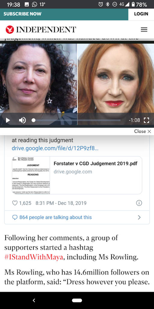
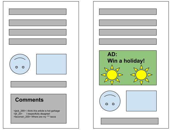
2 – Ads that load late and make content “jump”
It was difficult to take a screenshot here, but what I mean is that some websites don’t load ads in correctly-sized containers (or containers at all). This means that when the ads load, it’ll push the content down, as there is now a larger element taking up space above the text.
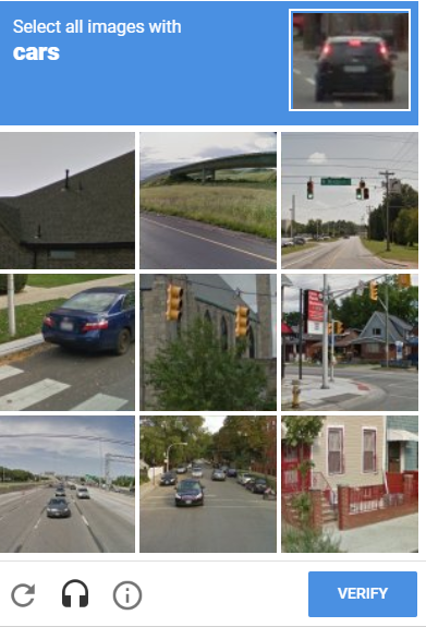
3 – Recaptcha
Now, I know that recaptcha is very useful in telling bots apart from real users. And most of the time, if you’ve solved the puzzle before, you can just tick a box. The issue comes if, for whatever reason (such as private browsing), you have to do the challenge again. To be fair, these challenges are usually easy, but sometimes you will be unlucky and make a mistake, such as not seeing something in a tiny part of the image, or because the image is low quality, then have to start over. So frustrating.
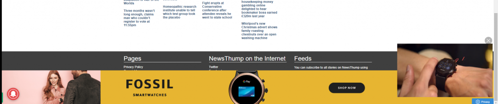
4 – Autoplaying videos
Bonus points if the video has sound.
Picture this: You’re on the early morning train, scrolling through your facebook feed, then some ad blasts music and annoys all the other commuters. Why.
Yes, you can turn it off in some apps. But it’s still on by default. Plus some websites will not have an option to turn it off themselves, requiring you to mess with your browser.
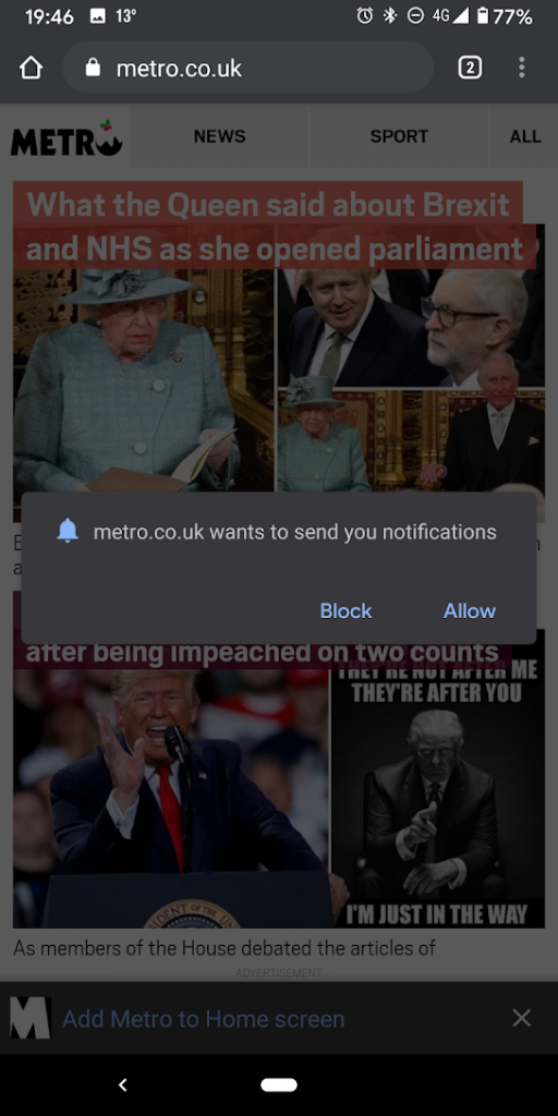
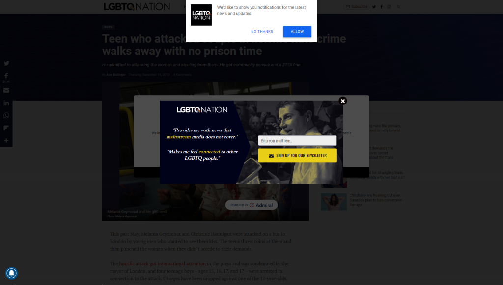
5 – Websites asking to deliver push notifications
Unless you’re my email or Slack app, I do not want your notifications. STOP asking me! What is worse, on mobile, this prompt will block the rest of the content until you block or allow.
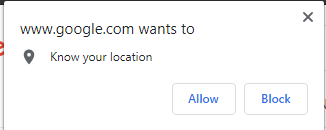
6 – Sites that ask for your location
I understand that it’s convenient in a lot of cases, in which case, I don’t really mind. But it would be better if they asked when you did something location-specific, not right away.
It seems that every single website nowadays wants the right to spy on your every move.
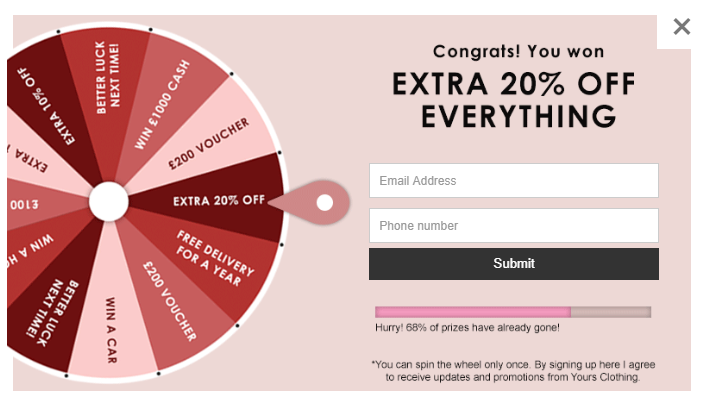
7 – “Subscribe to our newsletter!”
Don’t you hate it when every website in existence seems to ask for you to subscribe to their newsletter? I very rarely take them up on their offer. It’s good to be reminded about new blog posts in Interesting websites (although, no, this site does not have a newsletter), but other than that, I don’t need that junk mail.
8 – Blocking ad blockers
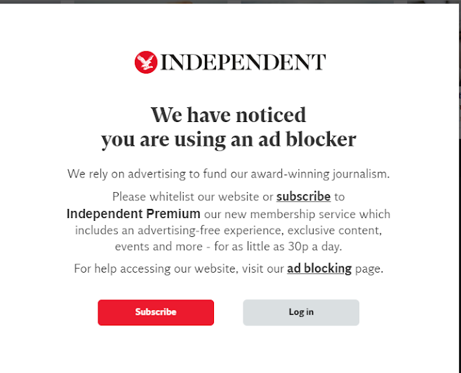
I understand websites need ads to make money, but the reason why I chose to use an ad blocker is that many websites have so many ads with moving pictures or videos that it’s a) incredibly distracting and b) really makes my PC struggle.
I have my ad blocker set to allow acceptable ads anyway. By “acceptable” they mean not ads that get in the way of UX. It is possible to have the ads not be a terrible use of RAM!
9 – Clickbait
But first, a short word from our sponsor– haha, just kidding! So, what’s the issue with writing catchy headlines to get views? Well, buzzfeed-like headlines such as “X ways Y happens! #2 will shock you” can be harmless for the most part.
But sometimes, clickbait is used to attract attention to false information. People will sometimes read the title without reading the article (hey I’m guilty of it myself!). If your headline is making things look way more serious than they actually are, then that helps the spread of fake news. Plus, many of those clickbaity articles are basically ads disguised as articles anyway.
Why did I use a clickbait title for this post? Parody, obviously.
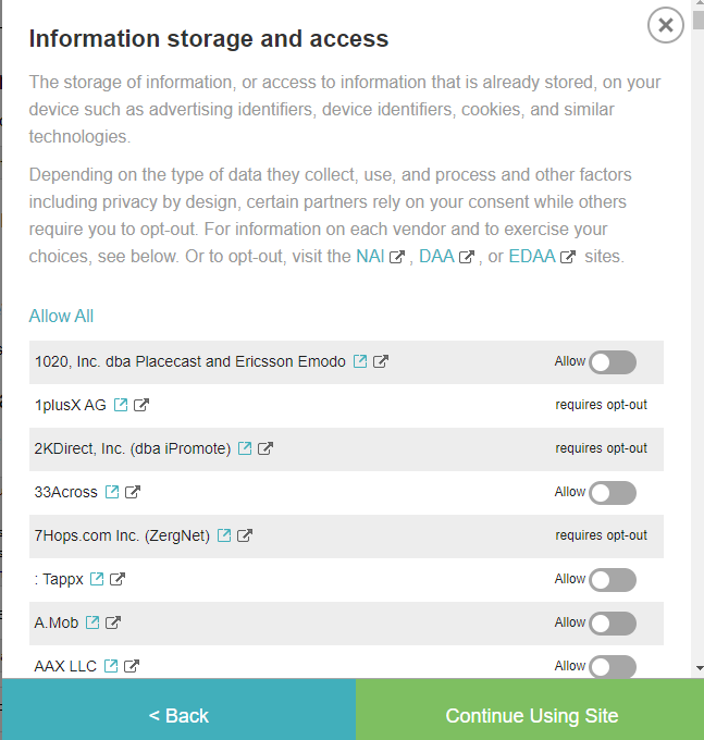
10 – Bad privacy prompts
Since the European laws about Cookies and GDPR came into effect, privacy prompts have been getting more and more intrusive. We get it, you want to track us, and you have to get our consent early in the journey, so the best thing seems to be to show a popup (it’s not).
Not all of those prompts are terrible, but sometimes opting out is more difficult than it should be, either because you have to manually opt out, or because it’s extremely slow. Why is this such a broken journey? Do you hate your users? Or are you just hoping they passively click “ok” at everything, because I sure just click OK.
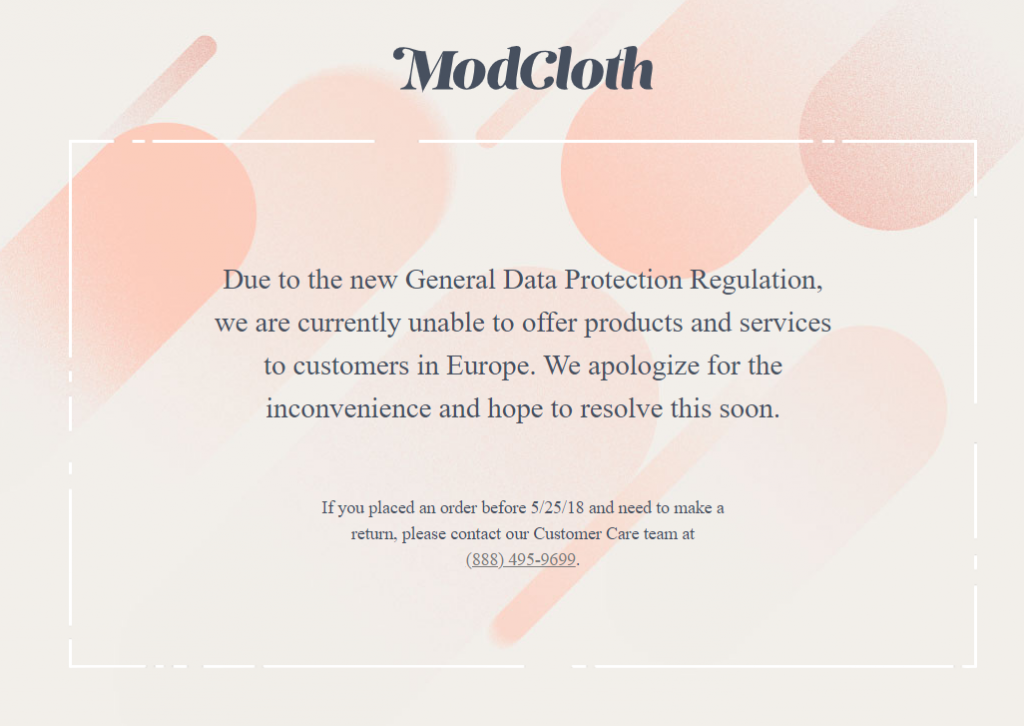
11 – Blocking EU visits because you cannot deal with GDPR
This is a pretty bad new strategy by some websites based outside Europe: Instead of trying to follow GDPR, they just ignore it, and in order to not get sued, just refuse to serve any EU IP addresses. I guess losing part of your user base is better than getting a GDPR lawsuit, but it would be even better to try to comply!
On a related note, what are they doing with our personal data that’s against the GDPR? Do I even want to know?
12 – Expiring sessions too early
Unless you’re a bank, or a similar kind of business that holds very private information about your users, your sessions can be longer than 30 minutes long.
I will never forget the time I lost a whole job application due to being kicked out of the site when trying to submit. ARGH, THE PAIN.
13 – Doing everything at once
Do I even need to expand on this one? No? Good. Alright, happy new year, mortals.
I’d like to thank the people in my slack groups who gave me inspiration. If you didn’t see your suggestion here, it’s because I had way, way more suggestions than I expected. I thought I’d struggle to fill this list, but it was very easy. For the avoidance of doubt, that’s not a good thing, since it proves how broken the Web has got.